The Perks of Post-Socialist Care

I should begin by saying that I like hospitals. I have fantasized about being hospitalized, preferably for at least a week. No one can ask you to do anything, food just shows up, and you get to spend a lot of time in bed. My idea of a guilt free vacation. Plus I’ve always prided myself on having a high pain threshold. But on a recent trip I was proved wrong. I’d travelled to Warsaw to speak at its Academy of Fine Arts and at the School of Form. Both of which are blameless for what happened to break my illusions of stoicism.

When you have the status of professor emerita, i.e., not quite fully in the game, it is gratifying to receive invitations to lecture and participate in conferences. It’s especially the case when the invitations come from Poland where I’ve been involved with various academic initiatives since 2013. Despite intervals of years, professional relationships with colleagues in Wroclaw, Poznan, and Warsaw have developed into lasting friendships.

So it wasn’t a complete surprise when Magda Kochanowska, Head of Design at the Academy of Fine Arts in Warsaw, asked me to not only speak at the third FAIR Design Conference but to also serve on the conference’s advisory committee. No matter that the last time we’d seen each other was in 2015 at the first conference she convened. (This time the theme was emotions. I chose laughter, and it would turn out that a sense of humor would come in handy.)

Knowing I’d be in Warsaw for at least a few days, I also contacted Jola Starzak, the Coordinator of the Design Program at the School of Form. Jola and I had taught together twice already in Warsaw in 2017 and 2018. This time she invited me to talk to her students about what I view as four basic ambitions of design—four things design hopes to do, each with its own set of values, each with its own historical trajectory.

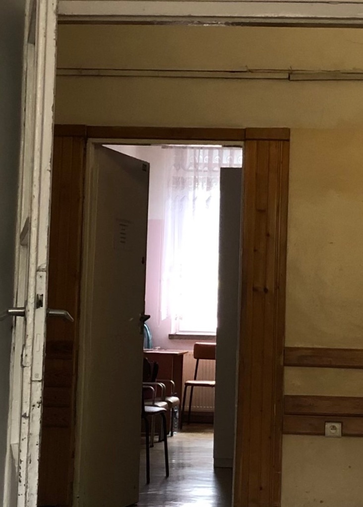
So far so good. It would be a short trip—only four days—but they would be very productive. (Little did I know then that four days would become fourteen.)  The lectures for Jola and Magda went well and I was really looking forward sitting back and enjoying the second day of the FAIR Design program. But it was not to be. On the way to breakfast in the hotel dining room, my shoe got caught on the edge of a stair and didn’t release.  I apparently did a kind of strangled pirouette. With nothing to break my fall, I landed hard on my right hip. That’s when I discovered that bone pain is a whole other order of agony.  

It’s also when I got lucky. Several of the hotel staff were trying to pick me up and ask me how I felt—in Polish, of course, which regretfully I don’t speak—when an English woman approached me and explained she was a nurse. Seeing that something was really wrong, she persuaded the hotel to call an ambulance and, much to my relief, explain to the medical emergency staff that I had to be put on a stretcher not in the wheelchair they were offering.  

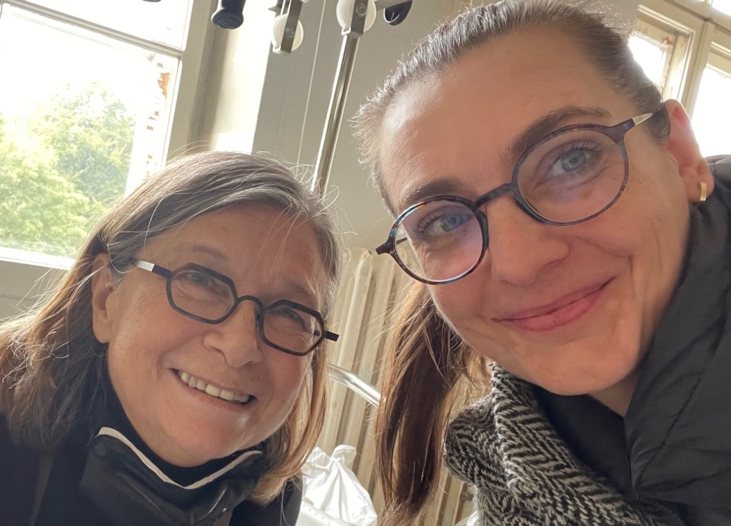
Unfortunately, I never did catch her name. But she was the first guardian angel of many who seemed to miraculously appear when I needed them. The second I did know: Ula Bzowska. Ula, the student assigned to make sure I didn’t get lost on the way to the conference, turned up at the hotel in time to ride with me to the hospital.  I doubt she thought her hospitality duties would include listening to an American professor yelp and groan for the hours it took to get admitted to University Clinical Center of the Medical University of Warsaw, a.k.a., the Hospital of the Baby Jesus. (More on that later.)  In any case, the pain medication they gave me was having no effect.  Fluent in English, Ula was also my interpreter when I begged for morphine. (No dice.) She told me what the doctors were doing and told the doctors why I was there alone without family. The latter circumstance, as I would learn, was fairly unusual and not without consequence.
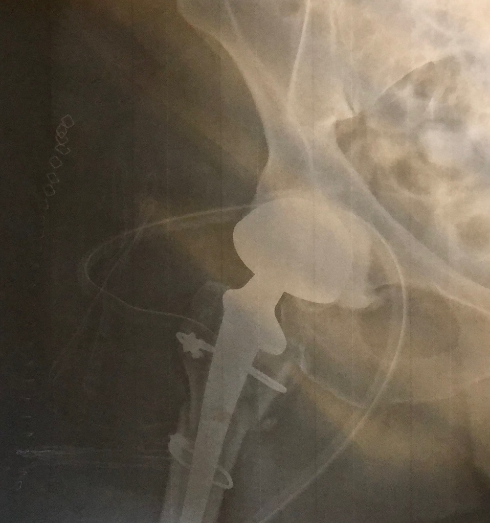
Before and after surgery.

left: fractured

right: replaced

After they x-rayed me, I was told that the fracture was complicated and that to fix it a large pin would be put into my femur. When I woke up from surgery a full two days later—don’t have an accident on the weekend—a doctor told me that they decided against the pin. Like Humpty Dumpty, there were too many pieces to put back together again. But unlike Dumpty, I was made whole again with an artificial hip. 

The next move involved transporting me from a subterranean recovery room to an eight-bed ward, where I was surrounded by other women who’d had more conventional hip and knee replacements. (Mine was a response to a trauma.) In the States, sharing a room with seven other fellow sufferers is rarely a welcome prospect. In Warsaw, I learned its advantages. It was like being in a support group with members who relied on smiles and gestures when words proved futile with me. They were apparently concerned that no family came to visit.

I may have been without family (my husband was at home installing grab bars) but I discovered that there were unexpected compensations to be had in being hospitalized in a post-socialist country. Even if I hadn’t studied the social dynamics of countries that were formally under Soviet dominion (like Poland), I am sure I’d have noticed that there was an entirely different culture operating in and around the ward I found myself in.  

I sensed a lingering tendency to prize the group over the individual in the life of the ward—though not in patients’ respective medical treatments. For example, privacy was not especially valued.  No modesty curtains separated beds. If they had, they would have inhibited the cross-bed conversations that went on into the evenings. I was happy there were no televisions (all tuned to different channels) but that didn’t mean that silence was especially important. Even if there had been a protocol of quiet, the hospital building itself would have made it moot. Built over a century ago, there was nothing to buffer the sounds of clanging doors or the choruses of conversation being conducted in the halls at night. Even the odd sleeping pill was no match for the hospital’s acoustic rhythms.

In general, amenities were scarce. Families are meant to take up the slack and provide things like bottled water, toilet paper, crutches, and pajamas, instead of hospital gowns which aren’t worn once you’re out of surgery. (I’ve since learned that this is not all that unusual in hospitals in southern Europe.) Fortunately, my suitcase had made its way from the hotel to the hospital, so pajamas weren’t an issue. However, the nurses did have to make an exception for toilet paper, as I hadn’t packed any in my luggage. And luckily, departing patients bequeathed their unopened bottles of water to newcomers. 

Over the course of my two-week stay (unimaginable in the U.S.), a surrogate family of colleagues and friends brought me both necessities and morale-building comforts. Jola brought juices and boxes of Ricola lozenges to keep me hydrated. Her visits also gave us a chance to talk further about her work as an architect and the possibilities of turning my lecture on design ambitions into a publication. 

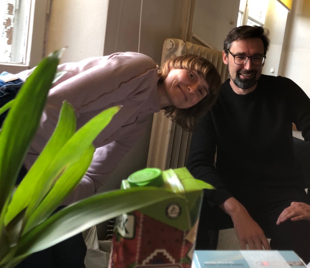
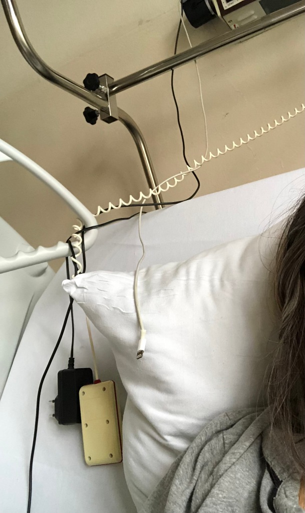
By sheer coincidence, my friend Pawel Pokutycki happened to be in Warsaw for a different conference. He visited several times, bringing a toothbrush from his hotel when mine disappeared, supplying me with health bars, and even a potted plant. Most critically, he replaced my iPhone cable with a longer one so I wouldn’t have to text holding the phone over my head. (The power adapter was plugged into a lamp fixture that was out of reach, making the task of recharging a major headache.) But mostly we had fun talking about each other’s design preoccupations.  

I was touched that Józef Mrozek brought me books and that Grzegorz Niwinski—Magda’s dean at the Academy of Fine Arts—also came to visit. As it happens, his son is a radiologist in the same hospital and he was able to reassure me that not only was I in the best hospital for a hip replacement but also that I had the best surgeon. Another stroke of luck.

Magda was my most constant visitor. She went out and bought the crutches that the physical therapists insisted I use; she also filled my prescriptions and made sure I had my quotient of sweets, which were definitely not on the hospital diet. There was no jello, pudding, or sherbet on the menu; in fact, there were no menus.  Unlike U.S. hospitals, nothing was even remotely consumer-oriented. This restraint, which I felt throughout Warsaw, could well be a function of the Polish economy, but I imagine it is also partly a hangover from the austerity of communist era, still in living memory for anyone born before the mid-80s. 

Which isn’t to say that this is a culture short on indulgences. Hospitals may keep sugar out of their patients’ diets but not so the city, which boasts numerous bakeries and chocolatiers, like the renowned E. Wedel where I did have a rich cup of hot chocolate before my fall. On my birthday Magda brought me slices of cake from Blikle, perhaps Warsaw’s best-known confectionary. She also brought the best truffles I’ve ever tasted from Cukiernia Sowa. (That Cukiernia Sowa exists at all is a testament to the Polish love of sweets, as it opened in 1946 when was rare for the government to permit such private business ventures to operate and even rarer to find sugar.) 

I don’t think I felt much pain after that.  But when I did, I found another save: taking screen grabs of translations and showing them to my doctors and nurses—an additional reason to keep my phone fully charged, besides being able to talk to friends and family back home.

It was through one of those phone calls that I learned that a Polish-American friend and her sister were coming to visit. Kasia drove in from Zalescia bearing gifts of extra paracetamol and an ice block. Anna flew in from New Jersey. Anna was coming to visit family, cast her vote in the Polish election that ousted the right wing government, and to give mutual friends a tour of Poland. Luckily for me she was able to add a hospital visit to her already-packed itinerary and bring me something comfortable to wear on the flight home. Not incidentally, she also managed to get me a shower. Otherwise, I’m not sure they’d have let me board.

Two more local heroes deserve a mention before this saga ends at Frédéric Chopin Airport. The first was a young man named Yan who stepped in to translate when I came out of recovery. When I arrived in the ward I was barraged with questions impossible for me to answer. Yan, who was helping a friend being discharged that day, explained he was in some kind of training program at the hospital. His interpreting skills couldn’t have been more welcome, as I was still a bit groggy from anesthesia and only able to say ‘thank you’ and ‘please’ in Polish. Yan, who I quickly learned was a missionary, came back for another visit. In other circumstances I would have directed the conversation away from his vocation, but it seemed only fair to ask him about it in return for his kindness. As a parting gift, he gave me a lenticular vinyl holy card with a shimmering portrait of Jesus, probably hoping I would return to the fold. I still have it somewhere.

The second person of note was a nurse named Elzbieta.  Her English was precise, and when it wasn’t she queried me about grammar and usage. We were equally curious about each other. I learned about her interests in cycling and other outdoor activities and she learned how much I loved cities (and walking not running).  We also compared our reading preferences, which, among other things, led to a curious exchange on the day I left the hospital.  It went something like this:

Elzbieta:  You Americans are direct, no?

Susan:  You could say that.

Elzbieta: Well, then. I know you are Christian but are you Catholic?

Susan (biting her tongue from asking how she ‘knew’): I’m culturally Catholic.

Elzbieta: Well, I’m wondering if you’ve ever read Hans Kung.

Susan: Actually, I have. Years ago.  He is an impressive theologian.  

Susan: Have you read Simone Weil? Weil was profoundly religious, though never baptized. You might find her interesting.

Elzbieta: No, I haven’t. Can you spell her name?

And then it was time to leave.  I still wonder why Elzbieta waited more than two weeks to query my religious literacy and can only conclude it was a parting gift. Perhaps it was another attempt to cajole a stray lamb back, this time taking a more cerebral tack. (She gave me no holy cards, though when I got home I discovered that someone put a broken rosary in my luggage.) In any case, I would have welcomed the chance to talk further. But by then the ambulance had arrived and it was time to go.

Magda, who had no intentions of letting anything prevent me from getting on a plane (she must have been counting the days), arranged for a medical transport to the airport, a.k.a., an ambulance.  It was a luxury only matched by the business class seat, which I splurged on so I could recline for the nine and a half hour flight. Recline and sleep. Magda made sure I had sleeping pills and painkillers to take the edge off. 

Even a lapsed Catholic like myself might be tempted to concede that the special dispensations of grace (a.k.a., unexpected help) that I encountered during my stay might be attributable to the hospital’s namesake—the infant Jesus, or at least the faith that virtually everyone around me seem to have in him.  What is certain is that I was the beneficiary of the parallel strands of mutual care that run through socialism and Catholicism at their best. And perhaps I was able to recognize them because I grew up in the era of Vatican II’s reforms when the values of the sacred and secular were closer than they are now.  

I know that many non-Catholics, friends and strangers alike, only associate the Church with its faults, and clearly there is no shortage of those, especially among the conservative clergy in Poland. Nonetheless I get impatient with the thinly disguised ridicule that all too often surfaces when the subject of Catholicism comes up. It confuses the Church’s politics with its fundamental ethos of mutual care. 

To be clear, I am not ventriloquizing Yan or Elzbieta, nor making the case for institutional religion of any kind. Nor am I attributing the coincidences of attention and concern that came my way to anything other than innately human generosity. But I do think I owe the optimism I felt during those first two weeks of my recovery to a generalized act of faith that things would get better. And I don’t know if I’d recognize an act of faith without some understanding of the concept of faith. 

Then, again, I do like hospitals.

Both/And: Textiles’ Fluid Dynamics

Detail of Stitched Canvas, Yelavich, from “Echo Chambers: David Young and Susan Yelavich, 1053Gallery, Fleischmanns, NY 2022

How to account for the attraction of textiles?  For me, it’s their interdimensionality. Both three-dimensional structures and two-dimensional planes, textiles, from the most simply knotted nets to the most technically advanced carbon-fiber weaves, hover between those states. A textile (even one as dense as felt) invites the eye to see its strands and, at the same time, see it as a field. This dynamic becomes further complicated when it is draped, folded, or otherwise attached to some thing or some body. Then thread, fabric, and scaffolding become a trinity of interdependence. 

https://www.sciencedirect.com/sdfe/pdf/download/eid/3-s2.0-B0122270509000466/first-page-pdf

However, the corporality of a textile doesn’t end there. Examined under a microscope, its fibers resemble tree trunks and layers of bark. The resemblance can’t be a coincidence, as trees and plants are also fibrous1 as, of course, are we. Fibers are intrinsic to our bodies; they are embedded in our nervous systems and muscles.2  Though when it comes to bodily fibers, we more likely to think of hair since it’s visible and ready to hand. It can be shorn like animals’ fur, or for that matter, harvested like plants. Birds are especially adept at weaving both plant matter and whatever natural and unnatural fibers to build their nests. Insects like silkworms can produce fibers of astonishing strength to build their cocoons, which in turn are used to make silk. What’s especially interesting about silkworms is their dependence on trees—mulberry trees whose fibrous leaves are the source of their nourishment. So it would seem that the inter-relatedness of fibers—whether of individual strands we can trace with our eyes or in the less apparent fibrous systems that operate in and between animals and plants—is the definitive quality of the textile. Finished or in-progress, a textile is both form and performance. 

Installation shot from “Echo Chambers: David Young and Susan Yelavich” 1053 Gallery, Fleischmanns, NY, 2022

What of embroidery or stitching which depend on a textile as a foundation? They are qualified textiles that come with adjectives, e.g., embroidered, appliqued, and stitched. This type of hybrid also includes velvets and brocades that integrate one or more supplementary warps or wefts into a basic weave. Unlike these structurally complicated textiles, whose fibers respect a predetermined order, embroidered and stitched textiles don’t necessarily conform to the structure they are grounded on.4 Instead, the threads and filaments offer a counterpoint, sometimes completely obscuring the fabric that supports them. That was the dynamic that operated in the last series of stitched canvases (above) for  “Echo Chambers,” a collaboration with artist David Young and his AI/machine learning programs.

Initial images for “Screens and Screening” (The center image taken by artist Joyce Haut was the catalyst for this series.)

Our next project, tentatively titled, “Screens and Screening” explores equivalences between figure and ground, between surface and structure, using a wire mesh screen as a point of departure.  A series of digital images were shot through three screens—the analog mesh of a screen window (and in some cases a kitchen sieve), the camera’s grid (a Bayer filter5), and the computer screen’s grid of pixels.  

The resulting composite image (below) is then printed on fabric mesh (the fourth grid) for me to stitch back into a jittery analog state, a.k.a., a new textile.  The ambition is to capture an intrinsic quality of all textiles, namely that of being in tension between states of open and closed that mirror the ones and zeroes of the digital.  

First “Screens and Screening” print to be stitched, courtesy David Young and AI/machine learning

Notes

1. Plant fibers are found as structural elements in all higher plants. Botanically the fiber is considered to be an individual cell, which is part of sclerenchyma tissue and is characterized by a thick cell wall and a high length-to-diameter ratio (reaching 1000 and more). The basic function of sclerenchyma is providing mechanical integrity to the plant. Spindle-shaped cells with tapered ends are considered to be a characteristic feature of the fiber cell. According to this definition, cotton (Gossypium spp.) fiber – probably the most well-known plant fiber – is not a fiber, but a trichome, the extrusion of epidermal tissue. CELL WALLS AND FIBERS / Fiber Formation J E G van Dam, WUR, Wageningen, The Netherlands T A Gorshkova, KIBB, RAS, Kazan, Russia Copyright 2003, Elsevier Ltd. All Rights Reserved.

https://www.sciencedirect.com/sdfe/pdf/download/eid/3-s2.0-B0122270509000466/first-page-pdf

2. Kamrani P, Marston G, Jan A. Anatomy, Connective Tissue. [Updated 2022 Jan 24]. In: StatPearls [Internet]. Treasure Island (FL): StatPearls Publishing; 2022 Jan-. Available from: https://www.ncbi.nlm.nih.gov/books/NBK538534/

3. Which isn’t to exclude geotextiles or synthetics; even a nonwoven fabric is bonded together by entangling fibers or filaments.

4. An example of an embroidered textile that does conform to its fabric ground is the stitched sampler. In fact, it was a lesson in order for young women in centuries past—the stitched equivalent of penmanship on lined paper. However, most traditional embroideries were meant to animate a plain fabric, not to submit to its discipline. 

5. The Bayer filter is a thin plastic film inside a digital camera that enables color imagery. It filters light through a grid of blue, green, and red squares.

Stitching light, analog and digital

Detail of stitched interpretation of AI reading of a darn

Lately I’ve been turning my attention to both the phenomena and the artifacts of pixels by stitching them. It began a couple of years ago when I made a casual observation to the designer/artist David Young that  some of his digital images bore an uncanny likeness to textiles. David’s images are particularly interesting because he creates them (actually, co-creates them) with artificial intelligence and machine learning programs. Sometimes he trains the AI on color blocks, other times, on landscapes.  We decided to see what would happen if he trained it on an actual textile—specifically, one of my darns, which are small, stitched weaves of thread. The result is an ongoing project we call Echo Chambers. (For the full backstory see: Negotiating the Image with Pixels and Thread.)

Print of the AI’s interpretation of a darn, manipulated by me with David Young’s custom software

In a nutshell, David trained the AI on a dozen or so photos of my darns.1 (This is the opposite of usual practice, which is to train the AI on hundreds or thousands of images so it can replicate whatever it’s been shown).  In any case, this AI builds a neural network of a darn      and the neural network generates images from its understanding via pixels. At some point, David stops the process, selects a still frame, and then we manipulate it with his custom software. The resulting image is printed on paper and transferred to mesh or canvas.  I then stitch it back into existence by referring to the lines on the mesh as general coordinates, but mostly by looking at the printed image.

When I started this project, I was simply curious to see what the translation would yield.  It quickly became a challenge to see how closely I could replicate David’s images. But the more I worked on them—I’ve now made 8—the more I wondered whether I was just doing paint by numbers with embroidery thread, or if the project could open up different ways of understanding the binary nature of stitching (which goes above and below a plane) and the binary of the digital’s ones and zeros.

Still from AI/machine learning view of a darn rendered in pixels

First I had to figure out exactly what it was that I was stitching, namely pixels. Thanks to Hugh Dubberly and Alvy Ray Smith’s book The Biography of a Pixel, I learned that pixels are derived from the crests of spatial waves1—waves mathematically derived from the patterns and intensities of light and dark that fill our visual fields. (The model comes from our biology. The eye’s retina transforms a visual image into a neural code of sine-waves that take their dimensions from the size and contrast of what we see.2)  

As far as I can tell, pretty much the same thing happens when analog is converted to digital. Except that it’s a sensor, not the brain, which translates the waves of contrast and scale into pixels. And for what it’s worth, Alvy Smith is at pains to say pixels aren’t squares.  The information contained in the crests and valleys of the waves is just translated into squares by reconstruction filters, or sensor grids, that collapse those peaks and valleys.3

Smith also tells us that both analog and digital images contain a lot of information that’s unavailable to our eyes because there is an infinity of points between the crests of the waves. Oddly, or maybe reassuringly, analog infinity is larger than digital infinity. 

So digital images are a compression of what we see in the real world. Which means that this Echo Chamber project is about the compression and decompression of my stitching. Compressed data is decompressed by stitching. And that introduces light back into the picture as it were:  Light bouncing off threads, light changing with the time of day, and with the effects of local color.  

But more than that, for me, it is an exercise in bringing the digital image into another state of being that is only partly predictable. It’s like knitting into the void of the space ahead of your needles. You both know and don’t know what will appear. No matter how mundane,what emerges, that something emerges, is always surprising. 

In any event, I’m wondering if the AI’s neural network input (my darning) and its output (the digital still) are yielding pregnant images. Perhaps the stitching is tapping into the infinity of points on both spatial waves and light waves to reveal otherwise invisible patterns—patterns that are still born when they’re printed, still born until I stitch their true subject, which is not a darn but light. 

What I do know is that stitching along and around lines of color (derived from pulses of colored light) printed on mesh, and then seeing them come into three-dimensional stitches is a bit uncanny. The result has the quality of a doppelgänger—albeit off-kilter and inexact. In these “Echo Chamber” pieces, there is a movement that is both seen and sensed, animated by reverberations from the liminal space between subject and object.  A phenomenologist might describe it as suspending conceptualization to reveal experience, which is probably why I still can’t pin down the meaning of the project, except to say that it seems to operate beyond the binary. Logic says it is not, but I cannot explain away the surplus of meaning I sense and see. 

Notes
1. Alvy Ray Smith. The Biography of a Pixel. (Cambridge, Mass.: MIT Press, 2021), 32.

2.  “Quality of vision in refractive and cataract surgery, indirect measurers,” Tais Renata Ribeira Parede, Andre A. M. Torricelli, Adriana Mukai, Marcelo V. Netto Review Arquivos Brasileiros de Oftalmologia · December 2013

https://www.researchgate.net/publication/260131039

3. Smith, Ibid., 51.

Threading the Pixel

What the human eye observes casually and incuriously, the eye of the camera notes with relentless fidelity.”   – Bernice Abbott

Work in-process

Lately I’ve been reading about the nature of light, specifically the light in (or is it of?) pixels. This is part of a larger project I’ve embarked on with David Young. (See Negotiating the Image with Pixels and Thread.) David produces exquisitely elaborated digital images that he co-creates with his custom-designed AI/machine learning programs. To date, our work has been built around his manipulated images of my darning (a form of woven mending), which I’ve been translating back into an analog state by stitching the computer-generated images onto canvas. 

One of my darns

I’m not interested in bringing the darn full circle, i.e., from cloth to printed image to stitched image. Rather than trying to produce a faithful replica, I’m interested in the process as a translation. I’m producing an analog version of what the AI does with the images it is fed.  Both the computer and I produce distortions. I do it with thread and the computer does it with pixels. But is this a child’s game of telephone or a double transubstantiation?

Precisely because I understand so little about the computer’s ‘translation’ of my crosshatched threads, I’ve become especially curious about the nature of pixels I’m stitching. Given that the same digital image can morph from fuzzy to spikey, from dense to sparse, when it’s manipulated on the screen, I wonder if a pixel behaves like a musical note which can be extended, dampened with a pedal, or sharpened by a quick touch.  Is there latent information in pixels that accounts for the variability in their appearance from one shift of a button to the next? 

I’ve tried reading Alvy Ray Smith’s A Biography of the Pixel and am still trying. I’ve also bumbled around on Internet sites. They’re like foreign language phrase books, good for discrete definitions but no help with integrating them into a sensible conversation.

Finally, I called on my friend Hugh Dubberly for help. A design luminary in the digital realm and an excellent (a.k.a., supremely patient) educator, I hit the jackpot when he said yes. I won’t rehearse his lesson (conducted largely over a two and a half hour Zoom), except to share the most relevant nuggets of the processes involved in producing digital color photographs. (Apologies to Hugh, in advance, for the quality of my translation; and apologies to readers who find this tedious.)

  • Natural light (in my case. bouncing off my stitching) enters the camera lens.
  • That analog light is interpreted by sensors.
  • Three sets of sensors are needed for color images to be constructed and seen.
  • Each set has a different color filter (a thin piece of plastic): red, green, or blue.
  • Clusters of these RGB sensors are arranged in a grid. In other words, there are many sets of sensors behind the camera’s lens.
  • Each sensor measures the brightness value of the light it receives and translates it to a digital (a.k.a., numerical) value.
  • That information is stored in the camera/computer.
  • When the user (I hate that term but it will have to suffice) retrieves that image (brings it up on their screen), they have a choice about how to display the stored pixels (a.k.a., stored ratios of filtered light intensity).
  • That choice is exercised by changing (or not) the numerical values measured by the sensor’s filters. 
  • What we see is a translation of numerical data to images made of light on our screens.
  • Screens are made up of display elements.
  • A display element can hold different numbers of pixels.1  
  • Changing the ratios between pixels and the screen’s display elements alters the image. (This is probably ‘coals to Newcastle’ for most readers but it was helpful information for me.) 
  • Each pixel offers up to 256 choices, which together make up the pixel’s bit depth.
  • Together the joint RGB pixel offers 16.7 million or 224 (two to the power of 24) choices of color.2

This last point was the one that answered the question I started with:  ‘Is there latent information in pixels that accounts for the variability in their appearance from one shift of a button to the next?’ What I was calling ‘latent information in pixels’ was, in fact, their dimensionality, their depth. And the clue was that pixel size is calculated by square roots. I remembered enough high school math to recognize that squaring a number—in the case of a pixel: 224—describes a three-dimensional space. (I also remember enough physics to know that light has velocity which entails time, as well as the dimensions of its waves; so light is multi-dimensional.) So my suspicions were correct (if not my reasoning): there is real depth in the image, at least on the screen. When the image is printed, I see it as an illusion but no more of an illusion than any other photograph.

I also recognize that there is an element of absurdity in this labored examination of the pixel. But in order to get a grip on what I’m doing, I find that, to paraphrase Roland Barthes’ observation in Camera Lucida, I have to work in two modes: one of calculations (available to anyone who knows where to look or who to talk to) and one of singularity to replenish such those calculations “with the élan of an emotion which belongs only to myself.”3

This print of a digitalized and manipulated image of a darned textile challenges the eye to discern its discreet elements.

Now I think have some comprehension of the variability possible in a single image that David retrieves from his AI/ML operations. However, it doesn’t lessen my fascination with them. Understanding them as calculations of measurements of light doesn’t denature them in the slightest. For there is another factor at work that I haven’t mentioned: the human eye/brain. Specifically, mine.

It has only recently dawned on me that this on-going project that David and I call “Echo Chambers” mirrors a predilection I’ve had for as long as I can remember. Namely, the near futile effort of trying to tease out specific elements in a densely packed space.

Close up of an Etch A Sketch screen. Lines are made when a stylus behind the screen scrapes away a coating of aluminum dust.

 In fact, I had a dream as a child in which lines would cross over each other against a white background. (N.B., there were no computer screens in 1955, so it was just a blank field.) The dream would turn into a nightmare when the lines got fuzzy and tangled and I couldn’t tell them apart. Then it made me anxious; now it gives me pleasure. Maybe it was a case of early optical migraines (which I still have) or maybe I was seeing floaters. Or, even more likely, it was a dream about my Etch A Sketch toy. (Though the red case, which you can see a glimpse of in the image above. wasn’t in the dream.) In any case, it seems I come this attraction to compressed spaces honestly.

I even went through a spell of constructing those spaces in the late 1970s. I’d just moved to New York City and was struck by the patterns of the fire escapes that cross-hatched so many buildings. It is also telling that I chose to describe that appearance of compression with a textile, specifically lines of ribbon, pinned onto monofilament, which was attached to opposite walls with nails. (Not sure what my landlord made of the scarification of the bedroom that had to double as a studio after we moved out.)

Untitled, ribbon and monofilament, 1977

Decades later, my attempt to derive stitched versions of pixels is yet another attempt to tease multiple layers of lines apart. Only this time I’m using thread to see into the patterns made by lines of light.

Detail of ‘digital darn’

And, of course, thread has its own degrees of luminosity and spatial dimensions. Paint or resin might capture light more effectively (I’m sure it would) but those methods would involve an aqueous process. I find that constructing with colored threads better approximates the way pixels construct an image. I am not shaping the thread into the square units but I am pulling it through a mesh of square openings. The canvas is my display screen; I manipulate the ratio of stitches to the display screen, creating coarser and finer versions of the printed digital image.

Whether this has any meaning beyond the material satisfaction it affords me (and possibly others) is an open question. For the present, I prefer to think of the stitched surface as a very modest exploration of the threaded textile as mediator as well as a medium in itself.   

Current work in-progress

Notes

  1. Typically, one display element maps to one image pixel; however, when images are scaled on screen, then several pixels might be mapped to one display element (for zooming out)or one pixel might be shown by several display elements (for zooming in).
  2. That is, 256 possible Red levels x 256 Green levels x 256 Blue levels is 16.7 million possible combinations.
  3. Roland Barthes. Camera Lucida: Reflections on Photography. Trans. Richard Howard. (New York: Farrar, Strauss & Giroux, 1982) 76.

Paul H. Yelavich (1959-2021)

If it is possible to be too good for this world, then my brother was.  Paul had no artifice, no game face, no guile. What he did have was a strong intelligence, a mind for details, a gift for the particular. Argue with him at your peril. He had a sharp sense of humor. He made a mean pecan pie and knew how to cook a steak. He had a big heart. (All of his sisters have boxes of Christmas ornaments chosen by Paul every single year.) When he cared about someone, he could be generous to a fault.

Younger than me by nine years, I probably spent more time with him in his first seven years, the years before I left home.  It was clear from the time he could smile—and he smiled a lot as a toddler—that he was an innocent. It was his fate to have four sisters, something beyond anyone’s control, but something that affected him nonetheless. Instead of being rough and tumble, he was sweet. 

Being a girl, I didn’t think much of it. But I’d hear stories when I came home from college about the petty (and not so petty) torments inflicted on him by kids at school. He wasn’t armored for those early battles (nor the ones to come later). In those days, children were supposed to stand up to bullies all by themselves. I imagine Paul tried harder to be liked. I imagine (since I wasn’t there) that this marked him as vulnerable in ways no one could see (or choose to see) but that he felt acutely. I ache for that boy. 

I don’t know when his serious drinking began. The fact is that he was able to hold his drink for decades. Until he couldn’t. But during those decades he was successful, rising to the upper echelons of corporate hierarchies. He ran in, and finished, the New York Marathon. He worked diligently at everything he did. Always with great integrity.  

Not all that long ago, Paul told me that I grew up in a different family. At the time, I was a bit hurt. I thought he was saying I wasn’t truly a sister to him. What he actually meant was simpler. The seven-year gap between the two oldest children and the three youngest did create two family cultures. If I was aware of it at all, I was a bit envious of my younger siblings’ relative freedom. My parents seemed to give them more latitude. After all, they didn’t send them to Catholic school, where discipline was strict. Nonetheless, to varying degrees, they also inherited the hobbling combination of self-censorship and pressure to excel that keeps therapists flush.

Paul and I often talked about the difficulty that arises when you free yourself of others’ expectations and then can’t figure out what it is you want to do, what you like to do, because you’ve spent so much time pleasing others. He knew he didn’t have to follow the family script but he never completely escaped it. Alternatives didn’t seem to present themselves; or if they did, their possibilities couldn’t stand up to the idea of the man he thought he was supposed to be. Furthermore, like many sons whose fathers’ love seems qualified, Paul patterned much of his life on his namesake. His work in aviation insurance was his not so tacit tribute to my father’s time as a Navy pilot and executive at Prudential Insurance. My brother’s last home was near Denton, Texas, the first town my father was stationed in during his stint in the Navy. Hard not to see a pattern. 

It humbles me as a parent to see the power we wield. I know my mother, who loved her son deeply, had no idea that her well-meant suggestions were received as cutting criticisms. She truly believed it was her obligation as a mother to speak her mind, never thinking it might be more hurtful than salutary. And I know my father didn’t deliberately set out to undermine his only son. But he was of the generation that didn’t give much thought to the psychology of parenting. Like so many of his contemporaries, he thought it was his job to prune out undesirable qualities he secretly recognized as his own. A child’s nature came in a poor second to a parent’s nurture. Even so, Paul never held it against them. He didn’t ask for much. He once told me that being content was enough. Tragically, holding on to that peace of mind, while wrestling with his disease, proved too much. I miss him.

John Egner (1940-2021)

There are innumerable ways of keeping the dead with us longer. We find them in photographs, keepsakes, old letters, clothes—in virtually anything they touched. John Egner gave us his art, and I suspect he might think that it is more than enough.  He wouldn’t be wrong. 

Still, we often feel the need for more time with the man. We can find him in our thoughts but they are as ephemeral as life itself.  Words, however, can keep him here a bit longer. Words (for better and worse) fix things the way pins anchor butterflies, and, of course, the pins survive their specimens.  

Does this mean words outlast the man? Not really, especially in John’s case, because his life continues in so many others’ lives. Words are our attempts at animating memories in the writing, knowing they will become fossils in the reading. So stubbornly I am collecting words that will keep John around a bit longer for me. 

Dedicated (to family above all)

Fierce (in his loyalties)

Certain (when giving advice, especially if he believed it was needed)

Generous (it goes without saying, to his friends, but also to the community of Andes)

Courageous (fighting fires, including ours in Bovina)

Committed (to his art: structured yet vibrating with latent energy)

Righteous (in his politics)

Genuine (no hidden agendas, no artifice)

Constant (never wavering in his conviction that Noam Chomsky got it right)

Quiet (when others were not)

Large (with the advantage of height, his presence was that much more felt)

Chiseled (his face, sometimes confused with Christopher Walken)

Sociable (to a point—a great host but often the first to go home)

Determined (to leave the world his own way)

This, of course, is the John Egner of New York City and Andes, not the John Egner of Detroit, who I never knew.  I leave it to others to flesh him out, realizing he’d laugh at the metaphor.

The Uses of Literature in Design Pedagogy

Delivered at the Design Pedagogy Symposium, May 20, 2021

Co-sponsored by School of Form, Poznan, Poland, and Center for Philosophical Technologies, Arizona State University, Tempe, Arizona

My contribution to this conversation is liberally drawn from my most recent book: Thinking Design through Literature.1 It affords students, and of course designers, an unusual methodology—not in the sense of a scripted process but in that it offers a different way of thinking about design and design’s effects.  

Thinking Design through Literature evolved from a course I taught at Parsons called Design Fictions: Illuminating the Nature of Design. It was offered as a design theory course, in which the theory was constructed by novelists, poets, and essayistsOnly once did I teach it in with a studio component. In that iteration, students had to read a work of literature and interpret it by designing a book of their own which expressed the design idea or issue that was central to the prose they read.  (This is something I’d like to do more.)  

Now regardless of whether it was a studio or a theory course, all of the students were asked to recognize design and designing in a broader way. Instead of thinking in terms of categories of practice, they had to think of design—formal and informal—as the configuration of things and places that set up the conditions for alternate ways of behaving. In other words, design as analogous to plot. 

And instead of thinking of literature in terms of its conventions  – fiction, poems, and essays, I ask my students to understand it as a compendium of scenarios in which things and places act. In other words, to understand literature as performance.

Why use literature instead of other means of understanding design’s effects? Certainly, there are ample assessment tools and ethnographic methods that are familiar to young designers today. But most of these fall short of conveying the depth and breadth of people’s relationships to things. They can only offer snapshots of experiences triggered by things, whereas literature contextualizes those relationships in life, albeit imagined. 

There is another reason that I find the pairing of literature and design to be so compelling. It affords designers the reassurance that they are not alone in facing their challenges. This use of literature has the effect of situating design in history—a history of ideas that respects no chronology.  

To wit, my book reflects the reciprocities between works of literature and works of contemporary design across time. This graphic by Escif in Katowice corresponds to a passage from Dante that reminds us when we seek the good (like providing electricity) with less concern than we ought to have, we will surely be punished (as with global warming.)

Please note, however, that the design projects included are not illustrations of the poems and novels they’re paired with.  Instead, each reinforces and amplifies the other. These poems and novels pose the same questions that absorb us in design: What is home? How far can technology take us? How can we contend with the absence that is death?  Moreover, taken together, the prose and the projects make a larger point. Namely, that design is never finished, and that’s because design is inextricable from its intended and unintended consequences in everyday life.  

Now given how vast the terrain of the ‘everyday’ is, I parsed the book (and the course) into chapters dealing with culture, politics, beings (e.g., robots, golems, and so on), technology, domesticity, consumption, the senses, and mortality. Here I will discuss just two particular works from two of those realms. The first is by Ivo Andrić and can be found in the chapter entitled, “Culture: Identity, Displacement, Exile.” The second is by Sigizmund Krzhizhanovsky and it’s in the chapter entitled, “Politics: Prosecution, Obfuscation, and Possibility.”

Bridge on the Drina
Kapia

I’ll begin with Andrić. His novel The Bridge on the Drina was written in 1945 and is based on an actual bridge in Bosnia. This bridge was designed by the architect Sinan (most famous for the Süleymaniye Mosque in Istanbul). Built in the 16th century, it has a very distinctive form:  It swells in the middle to create a space called a kapia. Andric describes the kapia as “two terraces daringly and harmoniously projecting outwards from the straight line of the bridge over the noisy green waters far below.”2 Note the words “daringly” and “harmoniously.” Putting them in the same sentence, in the same description, is significant for what it portends. Namely, that it’s both risky and stimulating to leave the comfort of your own kind and sit and talk with others, especially in communities divided by geography, faith, and custom. The architect of this bridge dared to risk harmony. He designed the possibility for cultural cross-pollination into a structure that otherwise brought conquest. Andric tells his readers how soldiers and colonizers:

crossed the bridge with reluctance. [They] … entered the town with disgust and, at first, were a world apart, like drops of oil in water. Yet a year or so later they could be found sitting for hours on the kapia, smoking through thick amber cigarette-holders.3

This bridge is no longer just a means of getting from point A to point B. Its kapia offers a place—for locals and occupiers alike—to drink tea, catch up on gossip, hear news from the front, and watch wedding and funeral processions of the town’s otherwise segregated Christians, Jews, and Muslims.  

Andrić also reminds his readers that this bridge’s social capacities grow out of the essence of all bridges. He describes the experience of it this way: “A man was then as if in a magic swing; he swung over the earth and the waters and flew in the skies, yet was firmly and surely linked with the town and his own white house there on the bank with its plum orchard about it.” 4 This is a truly fulsome design description of any bridge. 

Also, note that the phrases “flew in the skies” and “linked with the town” capture not only the physical sensation of being on a bridge, but also the spirit of what the philosopher Kwame Anthony Appiah calls partial cosmopolitanism. Unlike the cosmopolitan who completely abandons his identity to immerse himself in another’s (think of Lawrence of Arabia), Appiah’s partial cosmopolitans are loyal to the people in their immediate communities and also beholding to the others they encounter—they’re responsible to both polis and cosmos, ergo cosmopolitan. The beauty of the design of the bridge on the Drina is that it provides a space where cosmos and polis can meet. 

Here we see that same cosmopolitan intention built into another bridge. This one, in Sarajevo, was designed and built in 2012. The architects reprise the kapia by turning it 180 degrees and making it into a loop with a bench inside it for rest and conversation. It is an innately pacific structure.  The kapia is a tactic that mitigates but doesn’t deny the directional force (a.k.a., the strategy) of a bridge’s normal use. These two bridges, the one on the Drina and this one over the Miljacka river, both share and claim space—in particular the spaces of culture, which, after all, is the umbrella for this discussion.

To wit, it’s only when we leave home, walk out the door, and cross the threshold from the familiar to the unfamiliar, that we begin to understand the notion of culture – of us, them, ours, and yours. That’s when we begin to negotiate between the comfort of the familiar and the allure, or, in too many cases, the fear of the unfamiliar. It’s arguable that the work of being together and apart has produced some of the earliest and most significant forms of design. 

To put this in a historical perspective, its worth recalling Georg Simmel’s observation that the “people who first built a path between two places performed one of the greatest human achievements. [I]t was only in visibly impressing the path into the surface of the earth that the places were objectively connected.”5 And the potential embodied in those paths is sorely needed today when confrontation is more likely than encounter.  

Quadraturin

Of course there are political situations in which encounter is impossible and the only recourse is subversion. And subversion is the design tactic at the center of Sigizmund Krzhizhanovsky’s short story “Quadraturin,” discussed in the chapter on politics. Given that power is intrinsic to politics—some would say politics is power – it’s not surprising that issues of space dominate so many of the plot lines of literature produced in totalitarian regimes. 

Written in 1926, Krzhizhanovsky’s “Quadraturin” is a masterpiece of politics-as-space – not the space of official grandstands and marching grounds, but the intimate space of home. In Soviet times, the very idea of home was suspect. People in Russia and her satellites either lived in communal spaces or extremely cramped apartments. Krzhizhanovsky introduces us to one such person – a man we only know as Sutulin. As the story begins, Sutulin is approached with a bizarre proposition. 

 A man knocks on his door and says,

“I’m here on business. You see, I, that is, we, are conducting, how shall I put it…well, experiments, I suppose. Under wraps for now. I won’t hide the fact: a well-known foreign firm has an interest in our concern. [For] we have discovered – this is a secret now – an agent for biggerizing rooms. Want to try it?”6

There’s a further inducement. Quadraturin – the biggerizing agent – is free. Any warning bells that might have been set off by the words “secret” and “foreign” are quickly overcome. Sutulin takes the dubious ‘agent’ – a tube of paint – and immediately starts applying it to the walls of his 8 x10 foot room. The problem comes when he runs out of the magic paint before he gets to the ceiling and the room begins to warp.  Sutulin needs more Quadraturin. The trouble is, he can’t find the salesman. Even more disturbing is the fact that his room keeps growing.  Every time he goes out, he comes back to find his possessions shrinking away from him until he can’t find them at all. In fact, the space becomes so vast that, in the end, he cannot find his way out and presumably dies there. 

Sutulin is both victimized and punished for wanting more space. The price of his rejection of Soviet values, or even “experimenting” with them, is life imprisonment. Yet, Krzhizhanovsky seems to equivocate in his judgment, on the one hand, inferring that Sutulin should have been content with his lot; on the other hand, showing the individual’s complete lack of agency under Stalin’s rule – even and especially when he’s been given a ‘biggerizing agent.’ These two stances are not, however, mutually exclusive, though the ambiguity in Krzhizhanovsky’s position surely had something to do with the censors who banned it. In any case, what’s really being indicted here is the single-minded enforcement of ideals, communist or otherwise.  


Transpose the story to Brooklyn and you have what you see in this outdoor installation. Here, Maria Elena Gonzálezreplicates the floor plan of a unit in public housing in Brooklyn that is meant to accommodate a family.  (It’s not as tiny as Sutulin’s but it’s still quite small for a family of four.) The outlines of a kitchen, bath, bedrooms, and closets have been gently warped to transform the apartment into a flying carpet and a fantasy of larger living quarters. You could say it is a work of desire. The fable of Krzhizhanovsky’s “Quadraturin” plays out here, in the context of American public housing by an artist, who, incidentally, grew up in communist Cuba.

Where The Bridge on the Drina argues for design that is inherently open and non-hierarchical with its communal kapia, “Quadraturin” makes the case against domination by design. On the one hand, apartments are designed by the state to be confining (they even send out officials to check their measurements periodically).  On the other hand, the magic paint is designed to thwart the state but it too fails to keep its promise. Unlike Andric’s microcosm, Krzhizhanovsky’s world doesn’t admit doesn’t any spaces of negotiation.

Were I to teach these novels again, I would still have the students excavate the design ideas that are anchored in the authors’ words. But before discussing them together, but I would start by asking them to give the book a different title, a design title, just to see how much they were able to intuit independently. I am fairly sure most of my students would have initially said that The Bridge on the Drina is a book about ethnic frictions, soldiers, colonization, and bureaucracy and not a bridge. And that “Quadraturin” is about oppression, not its material enforcement (the magic paint). While they aren’t entirely wrong, they miss the potency in things—in large part because we have told them things don’t matter only experiences—and they confuse the ostensible subject of a story with its objective.  

The work then becomes seeing just how those ideas are embodied respectively in the bridge and the warping room.  I would also hope that they might take an even larger view of these fictions and consider how this urge to grow our spaces, to exceed what we have, and to travel to and from home, is programmed into the DNA of being human, and thus designing.  

Anonymous student interpretation of “Baucis,” in Italo Calvino’s Invisible Cities

I’d also ask them to design something that through it’s form, structure, and/or situation embodies the design values they’ve identified:  cosmopolitanism in the case of Andric, and agency in the case of Krzhizhanovsky—and in doing so, see this literature and its counterparts in design as personally relevant and relevant to situations outside of their own. I would further hope that, without discounting the different cultural perspectives they bring to their readings and conversations, that they might detect some principles that transcend their differences and see value in designing bridges and agency between and among them.

Notes

1. Susan Yelavich, Thinking Design through Literature (New York/London: Routledge, 2019).

2. Ivo Andrić, The Bridge on the Drina, trans. Lovett F. Edwards (Chicago: University of Chicago Press, 1977), 14–5.

3. Ibid., 96–7.

4. Ibid., 174–5.

5. Georg Simmel, “Bridge and Door,” trans. Mark Ritter, in Simmel on Culture: Selected Writings, ed. David Frisby and Mike Featherstone (London: Sage Publisher, 1997), 171.

6. Sigizmund Krzhizhanovsky, “Quadraturin,” in Memories of the Future, trans. Joanne Turnbull and

Nikolai Formozov (New York: New York Review Books, 2006), 3.

Notes on Design and Comedy

What follows is the beginning of a longer work on the uses of comedy in design. Readers, if you’re out there, please feel free to send me examples.

Handrail, Dubrovnik. Author’s photograph.
This overtly literal handrail wittily calls attention to an everyday object we normally take for granted.  The hand that secures the railing to the wall apes the security it affords our own hands. This pun made of stone not only gently spoofs that dependency, it also makes a sly joke about architecture itself. A hand reaching out from wall is an uncanny reminder of architecture’s primary obligation. Namely, to protect us.

Explaining a joke is a sure way to kill it.  Sharing a joke is another matter.  Told well, it comes to life. Told by design, it becomes incarnate. When punch lines are performed instead of being spoken or written, a jibe at table manners can be cast in clay, a jaundiced view of doctrine forged in metal, a poke at social mores projected from a fountain, and a witty reminder of human frailty set in stone. Mistakenly underrated, as comedy always is, the work of design’s tricksters runs the gamut from calculated schadenfreude to critical antidotes to pieties to pleasure-giving surprises. 

Perhaps the reason that no one talks about it very much is because humor is a violation of design itself, if you believe that design should be unobtrusive.1 Design that operates by its wit is deliberately, if not immediately, conspicuous. It can work as a sudden shock or a slow burn that tells the brain and body that something’s amiss. Either way, design that is comically unpredictable is an affront to rationalist sensibilities, especially those that hold to the position that the design ought to recede in the process of being used. Some would go further and claim that objects and places are incidental, even extraneous, to the purposes they serve.  But that idea is fundamentally flawed. It doesn’t matter if the design intent is sober or subversive, every act of design must have a catalytic agent—an object, a plan, a building—and it must have an effect. Though one might value an outcome (like sociability) more than the object (a park bench) that stimulates it, the designed thing and its consequences are inextricably bound. 

Design that operates on humor almost always raises the question: what made me laugh, smile, jump, or howl? That’s because, unlike much of design, its effects are unexpected and the source of it all isn’t obvious. Where comedy is sly, design is supposed to be transparent. We want to be able to count on it to do its job, and when it deliberately doesn’t, we need to have a sense of humor.  The object’s ‘function’ then is to help us develop one, and in the process, a healthy brake on our efforts at control. 

The notion that design might be funny has also been eclipsed by its dedication to pursuits that are increasingly serious. I don’t mean serious business, though that has happened too. I mean serious as in responsible. In recent years, the scope of design practice has widened to take up the twin challenges of extracting design from systems of inequality and deploying design to frame alternative responses. However, within the virtuous ‘responsible’ is the broader idea of responding. Humor qualifies, and not just as a way to sweeten the pill of critique but also as a way of checking design hubris.

What is often overlooked is that humor operates in ways that are parallel to design itself.  In On Humor, philosopher Simon Critchley describes humor as a combination of therapy and critique that bring human beings back from what they have become to what they might be.2 His view echoes Herbert Simon’s oft-quoted maxim that design is a matter of “changing existing situations into preferred ones.”3 The validity of both claims—that humor shows us what we are and what we might be, and that design proposes how we might be otherwise, is contingent on what is “preferred.” The immediate humor of a classic gag like a pie in the face comes from the body’s surprise at the sweet assault—not quite a “preferred situation” for most people. It is the ego-deflating effect that qualifies it as ‘preferable.’ Humor levels as it critiques, bringing us ‘back from what we have become to what we might be.’ In other words, less full of ourselves. 

Problems arise, however, when that whipped cream is soured by intentional humiliation. Divisive humor is only funny to the joker who delights in belittling his target. With the rise of egalitarianism, or at least professed egalitarianism, things like vinegar Valentines, popular in the 19th century, are now considered more offensive than funny. They may appear amusing at a distance of over a century, but only in the sense that all caricatures do. The exaggeration of a personality trait is one thing if you encounter it in an archive; it was another for the recipients of this kind of pictorial abuse. (They were, indeed, sent.) Which isn’t to say that there isn’t a place for righteous satire, only that this kind of exercise of power is best done by the Davids of the world and not the Goliaths.4

19th-century “Vinegar Valentines”

Whether subtle or bald-faced, satire, pranks, and quips interrupt our complacency and disrupt our tacit acquiescence to the way things are. ‘Things,’ for my purposes here, include tangible and intangible, formal and informal instances of design, e.g., rituals, places, objects, and images. Physical comedy, where the relationships between bodies and things contradict our expectations, sets the stage for insurrection, even if that insurrection is only a smile that breaks the heedless momentum of our days and a brief release from our usual inhibitions.5

  1. There is always a place for an economy of means in design. A stop sign, for example, must be succinctly serious. That said, in realms less urgent than health and safety, the modernist belief that ‘less is more, which may account for the fact that very little design has a sense of humor about itself.
  2. Simon Critchley. On Humour. (London/New York: Routledge, 2002), 15.
  3. Herbert Simon, The Sciences of the Artificial. https://monoskop.org/images/9/9c/Simon_Herbert_A_The_Sciences_of_the_Artificial_3rd_ed.pdf
  4. Given the surfeit of attention to witty graphic posters, political cartoons, and mocking illustrations, few will be considered here.
  5. Ibid., 108.

Design in the Time of Covid

March 26, 2021 Today listening to the tributes to Michael Sorkin (https://www.youtube.com/watch?v=a6wChlf8398), I realized how indebted this piece is to Michael who recognized that, in the words of Joan Copjec, “comfort isn’t friendly.” I now dedicate it to him, knowing that my prose pales against his, but trying to write the city, nonetheless.

Pier 26, NYC

I’ve lived here for 46 years, first uptown near the border of East Harlem then downtown in Soho watching the city’s image go from blight to bling. Of course, the reality is a bit more complex. The City of Profit is forever in tension with the City of Conviviality—conviviality being reason we choose to live so closely in the first place. The chance to profit is why we tolerate the congestion. Today, in the midst of a building boom—so counterintuitive when small businesses are shuttered everyday—New York seems more like Italo Calvino’s Zobeide (built of a lustful competitiveness) than his Zora (built of the experiences of its inhabitants).1

So why am I still here? Luck. I’m here by an accident of real estate  (produced by Zobeide) and the protection of the City’s loft law (written by Zora). It also doesn’t hurt that I like living in a place that’s not totally pristine. Soot comes through our leaky windows; we don’t have a doorbell so we have to schlep up and down three flights of stairs; and our mail regularly ends up in a neighbor’s box. These manageable inconveniences are almost all that’s left of the city I love, which is decidedly not the city of slick glass towers. The worst part of these mirrored buildings, now jostling for space with their asymmetrical and needle-nosed cousins, is their collective snub to street life. 

Perhaps we shouldn’t be surprised since so many of these buildings are empty of residents; they are simply investments—and investments have no need of groceries, shoe repairs, plumbing supplies, or coffee shops. They recycle the modernist penchant for sinking the building directly into the ground (think Mies’s Seagram Building) or conversely, lifting it off the ground on piloti (think Corbusier’s Unite d’Habitation). With few exceptions, these latest iterations of the skyscraper leave no space for the windows and services that entertain us, that reward us for walking the city. Apparently looking is discouraged. (I’ve even seen signs on noncommercial buildings saying:  “Private Residence. Please do not stand in front of window. Thank you.”)

Duane St.
Prince St.
Raoul’s, Prince St.

However, just as Manhattan was in danger of becoming an indoor city, Covid struck. And once it became apparent that the pandemic was here for the foreseeable future, another kind of architecture started to appear. Plywood and planks of 2’x4’s were suddenly in great demand as informal shacks started populating the sidewalks and streets as restaurants. Over the months, they evolved into what Robert Venturi called ‘decorated sheds.’2 One of my favorites is, in fact, not a restaurant but a clothing store called Daily Paper, whose architects sheathed a nondescript building in lathe, studding it with crushed tin cans that gleam like gems in the sunlight.

Daily Paper, Delancey St.
detail, Daily Paper

But the rise of the decorated shed really must be credited to the more sociable restaurant. On my Covid walks, I’ve seen a Thai temple, a faux-forest enclosure of birch branches, a hut sporting Alpine-themed lattice, and inevitably, American Express-branded structures that look like very tidy train cars, hooked together along a city block.

Faux rug and faux tortoise shell, raising the ante on DIY

It didn’t take long for these sheds to be ornamented inside as well as out. It’s now common to find them kitted out with stylish lighting fixtures, drapes, plants, flower boxes, and blankets for diners braving freezing weather this past winter. Festooned with strings of lights, these cheerful manifestations of tactical urbanism give the city a feeling of carnival. Acting-out has become eating-out. There’s a bravado built into these carnival tents of plastic and wood that reminds New Yorkers that it’s still possible to ‘make it here.’3

Greene St.

And if you’re having trouble making it—it goes without saying that eating out is prohibitive for those whose livelihoods have been lost or are hanging by a thread—New York’s better angels have an answer for that which also involves improvisation:  Mutual Aid Groups. Just yesterday I walked by a small wooden cabinet on the Lower East Side whose shelves were open to the street with free food for anyone who needs it. There are also more networked efforts like that of theFridgeGirls.com who stock sidewalk refrigerators that are in turn cleaned by volunteers and given electricity via extension cords from local businesses.4

theFridgeGirls

Both of these examples—sit-down street restaurants and stand-up street pantries—raise a more interesting question than ‘what should be designed for New York post-pandemic?’  The better question is:  How might we support the city of New Yorkers: native, new, or transient? 

Designers can (and increasingly do) provide support in amplifying initiatives like the ones described here. They do it with systems that are socially sustainable and with materials and structures that are environmentally responsible—and, in an ideal world, without sacrifice to beauty. (Beauty being a quality that varies from neighborhood to neighborhood, block to block.) Together with their neighbors, designers can challenge the politics of money that controls who eats where, who eats well, and who eats at all in the City, and in doing so, design the City of Conviviality.

Coda: If this portrayal of New York sounds familiar, I’m not surprised. Many cities have similar improvised places and systems of care. Please don’t take this essay as more than a provincial snapshot.

I am tired of American exceptionalism and all its variants.

  1. Italo Calvino. Invisible Cities, trans. William Weaver (New York: Houghton Mifflin Harcourt Publishing Company, 1972) 45, 15,
  2. Decorated sheds are “systems of space and structure are directly at the service of program, [where] ornament is applied independently.” Denise Scott Brown and Robert Venturi. Learning from Las Vegas: The Forgotten Symbolism of Architectural Form. (Cambridge, Ma.: MIT Press, 1977), 87.
  3. One of New Yorkers’ favorite anthems, regularly played at Yankee Stadium, is Frank Sinatra’s “New York, New York” with its famous refrain: “If I can make it there, I can make it anywhere.” 
  4. Thanks to Vyjayanthi Rao, faculty, Spitzer School of Architecture, CUNY, for directing my attention to theFridgeGirls.

‘Empty time’

From my earliest childhood I had the problem of empty time, of afternoons as ominous as the gaping mouth of an abyss.

__César Aira, Artforum

In that singular act of literary theft (not to be confused with plagiarism), Aires caught and stole my own dread of vacant time. It’s a sensation I associate with summer afternoons when my mother took us on her visits to her aging parents in Rochelle Park, a lower-middle class enclave in northern New Jersey. It was a regular destination as my mother was of the generation that continued to help out at her parents home, even after she was married with children. In her case, the help was truly needed. My grandfather had had a stroke; her oldest siblings had had polio; and my grandmother couldn’t manage alone. In addition to observing the usual rituals of visiting relatives, my mother was modeling what would be expected of us as daughters when she brought me and my sister Christine along on these trips.

And that’s how I thought of those visits even though they only took a half hour by car. They were trips. I knew that the dentist who lived on across the street took ‘trips’ to Europe with his family, but it was insinuated that they were almost immorally extravagant. My family took ‘day trips’ to the Jersey shore and, for many years, short trips to Rochelle Park, where my parents grew up. It’s a small town about a half hour from Manhattan, but for a child of the 50s, it might as well have been Aires’ Argentina.  It was another country. But then everywhere outside my house was another country. Even sleep-overs were tinged with anxiety. My limited experience braced me for the possibility that I might have to do something strange like wear socks to bed or deal with the fact that some families thought nothing of drinking soda at dinner.

I loved my grandmother, but her house was an alien sensorium made up of ammonia on linoleum floors, Noxema face cream, fluorescent kitchen lights, dull brown wallpaper, and grainy black and white television operas watched by my grandparents and my uncle who loved to show off his false teeth. You would think that being told to go outside would have come as a relief. But what I really wanted was to stay inside where I could read or draw—activities that to this day can block out the world around me. At the time, ‘the world’ was my grandparents’ microcosm, which hovered just above the poverty line. Nonetheless, at any sign of good weather, we would be chased outdoors and away from adult conversations about insurance, doctors, bills, and fraught exchanges about minuscule sums of money. (“Marie, Please take it.” My mother: No, please keep it.” The ‘it’ being two or three dollars.)

The problem with ‘outdoors’ was that it had no shape, no story—or none that I could see. You had to impose a story onto the geographies of backyards, fields, empty lots, or woods. Some children thrived on it. But for me the outdoors was alien, and it made me nervous.  My imagination shut down outside. I thought it was dangerous. There was always a chance of encountering children and adults you didn’t know, who might be up to no good. I still think I was right to be a bit fearful.

The exception to my aversion to ‘going outside’ was the sandpit at the end of my grandmother’s street. The sandpit had a shape; it had boundaries. A squarish dusty hole in the ground, it was probably a lot waiting to be developed in the postwar housing boom. It’s hard to imagine it being considered child-friendly today. Its banks were so steep that to avoid falling head over heels we had to slide down on our backs. It was kind of like sledding in the summer. That part was fun. But it wasn’t enough to fill the seemingly endless hours before we could leave. It never occurred to me to make the sandpit more entertaining by, say, pretending it was a desert. After all I’d never seen one. I was an extremely literal child.  (Now I wonder if that lack of imagination accounts for why I can’t write fiction, even though most of what I read is fiction.)

Once we’d exhausted the possibilities of sand as we found it (which were few without water to make it hard enough to mound), we made our way back.  By then we hoped we had spent enough time outside to appease the powers inside.  It was time to close the yawning mouth of the abyss of what felt like wasted time. It’s something that still makes me anxious, as much as I try to outgrow the feeling that time is something I need to hoard or there won’t be any of it left for me.

Even into the second year of the Covid pandemic, with almost nowhere to go and nowhere to be, I still fear the abyss of lost time. Or rather time lost. I begrudge the minutes it takes to get dressed (I’m aware of each button buttoned as a task), to change the batteries for my hearing aids, to put the dishes away, to figure out where my pens have gone, and above all, to vacuum. I do all these things—sometimes simultaneously to save time—with a mild resentment that they are robbing me of time that could be spent making something. I’m sure there is something wrong with me that I cannot give in to the minutia of daily living or that I notice these things. And, paradoxically, in addition to thinking of them as thieves of time, I also think of them as accomplishments–boring accomplishments along the lines of paying a bill or making a doctor’s appointment, but accomplishments nonetheless. I take note of these mundane rituals to prove to myself that I’m not really wasting time, at the same time resenting the time they take. I think it’s a genetic malfunction:

I once had an uncle who we all thought was supremely lazy. He would go to Florida on vacation and call my mother before he came back and ask her to open the clothes washer, put in the detergent, and set it to the wash cycle, so all he would have to do is put his dirty laundry in the machine. It was selfish and absurd. But now I think it get it. In his mind, he had better things to do.